Overview
For this project, I alongside another designer led the company’s rebrand following an acquisition, focusing on evolving the identity without losing recognition from its existing branding. The goal was to modernise and refine the brand, addressing concerns that the previous design felt cluttered and outdated. We developed a stripped-back, clean, and simplified visual system that retained key elements from the original identity to ensure continuity, while introducing updated typography, colour, and layout choices to give the brand a contemporary edge. This approach allowed the company to transition smoothly into its new chapter, presenting a refreshed yet familiar identity that feels cohesive and future-ready.
Finova
Finova.tech is a UK-based fintech company providing cloud-based lending and savings technology to banks, lenders, and brokers. Their modular SaaS platform streamlines mortgage and savings operations, enabling faster product launches, improved automation, and reduced operational friction. Serving over 60 lenders and 3,000 brokers, Finova is recognised as one of the UK’s leading providers of mortgage and savings software solutions.
Colour palette & Typeface
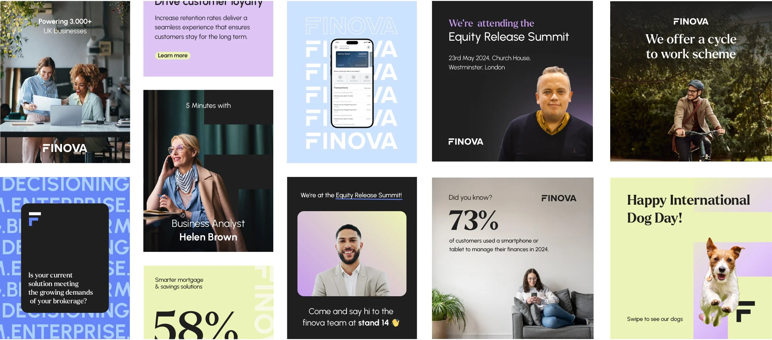
We approached the visual direction with a focus on balance and intent — using a considered mix of stock imagery and cutouts to create space, rhythm, and alignment with the brand’s tone. Every typeface choice served a defined purpose: Urbanist for its geometric clarity and modern neutrality, Larken for its structured warmth and typographic depth, and Shadows Into Light to inject a subtle human touch. Together, these elements formed a cohesive system that felt contemporary, approachable, and distinctly on-brand.

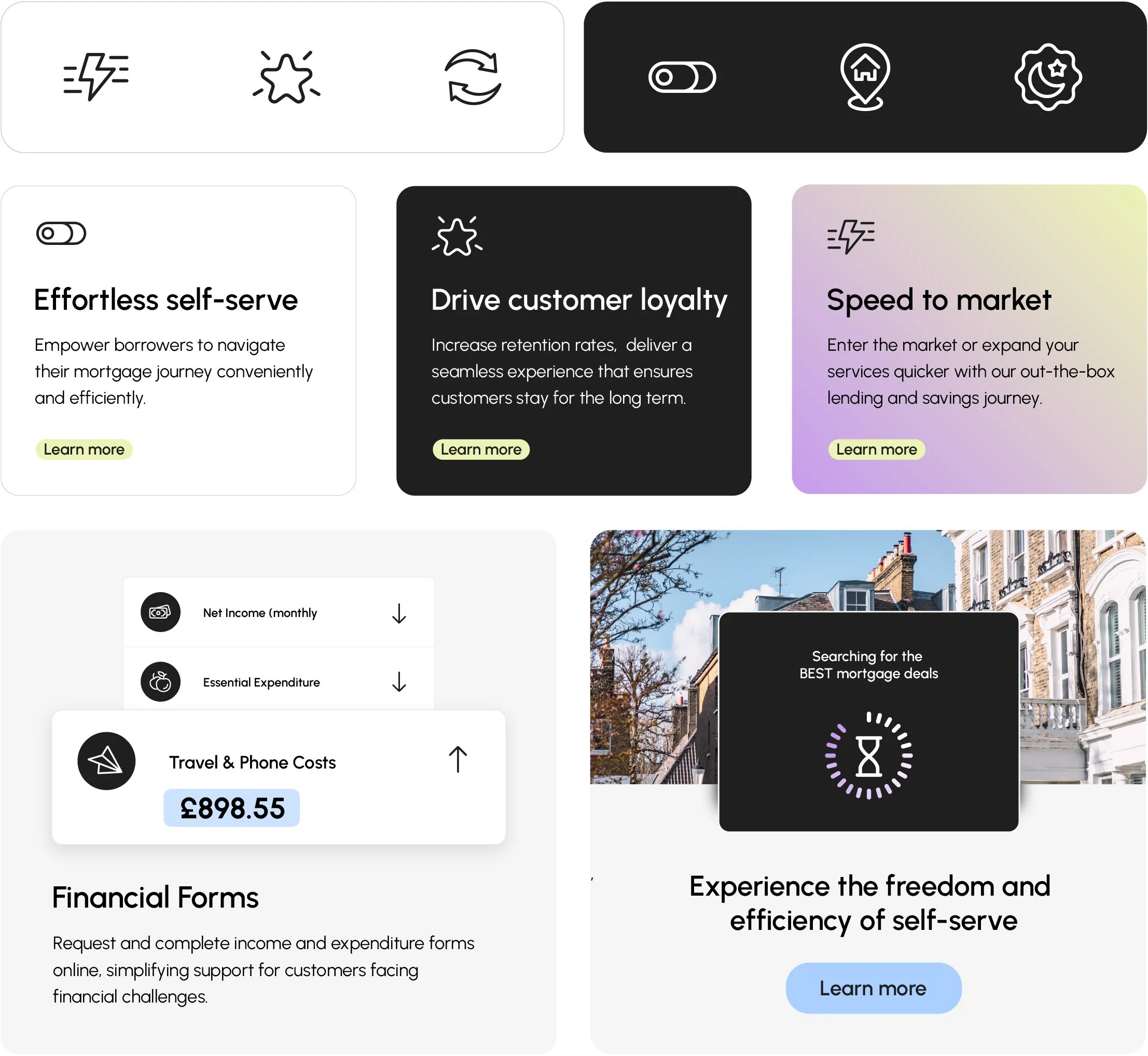
Icons
We prioritised a simple, cohesive icon library to solve previous pain points around clutter and inconsistency. Minimal, well-crafted icons enhance clarity, communicate ideas quickly, and complement the overall design without overwhelming it. This approach ensures a unified, recognisable visual language across digital, print, and motion applications, while keeping the system flexible enough to adapt or expand as the brand evolves.