CHALLENGE
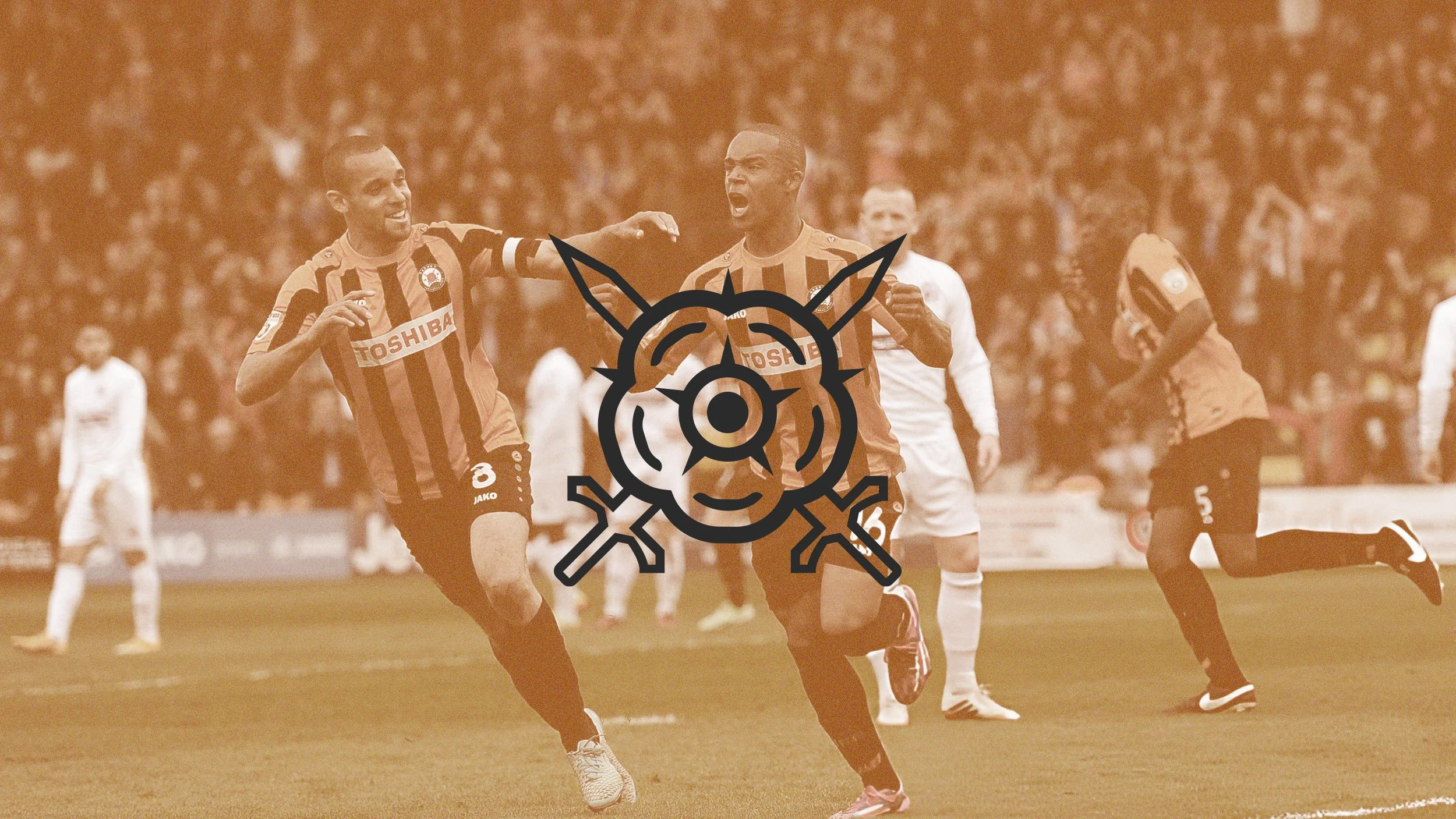
Barnet FC’s visual identity has remained largely unchanged for many years. This concept project explored how the club’s brand could be modernised while preserving its heritage and recognisable elements.
ROLE
Independent concept project exploring brand identity design, environmental graphics, and kit design for a modernised football club brand system.
APPROACH
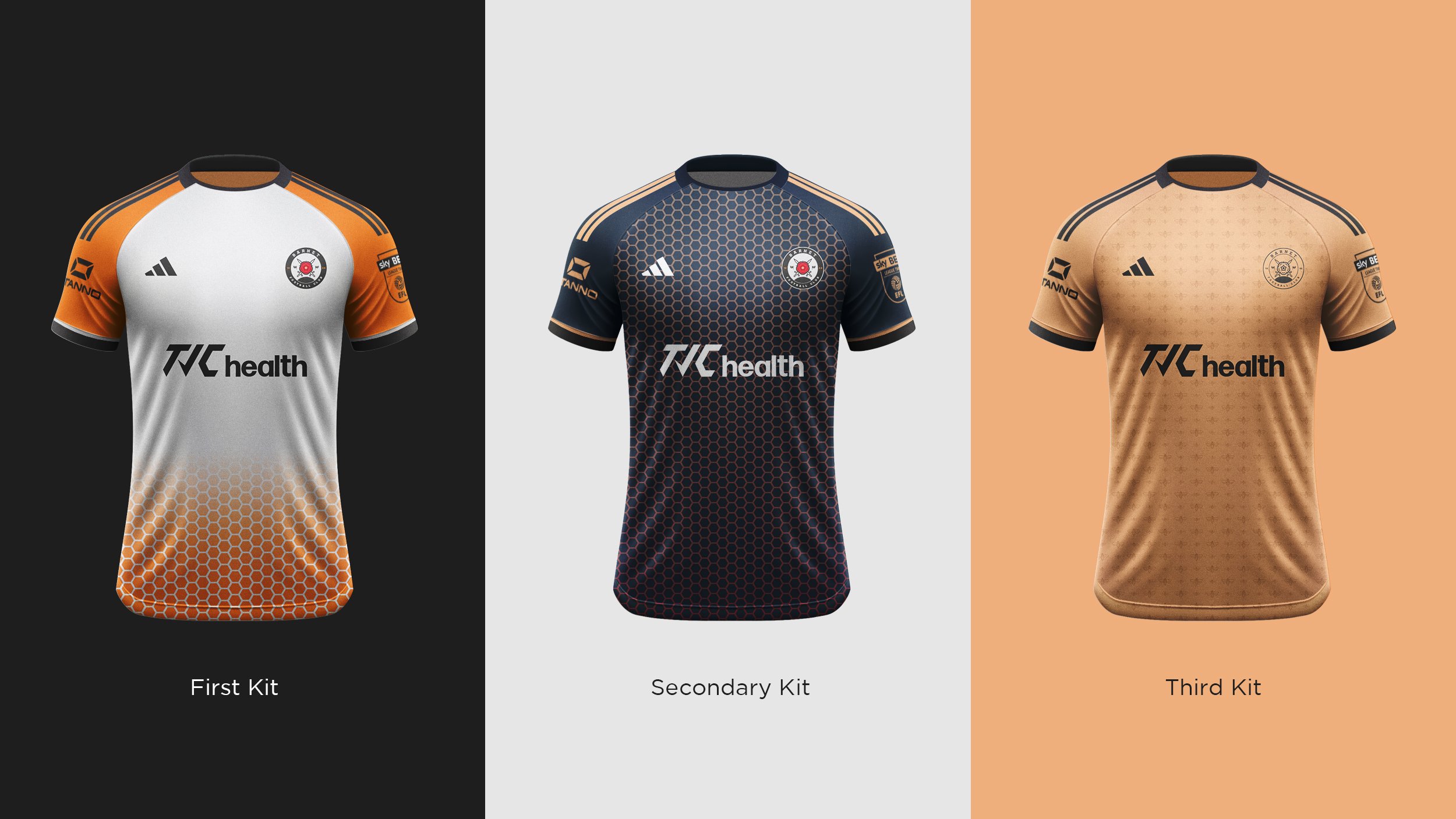
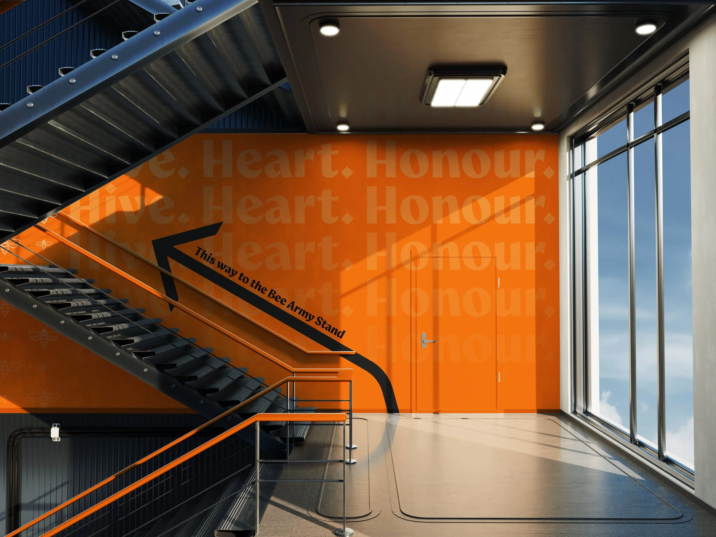
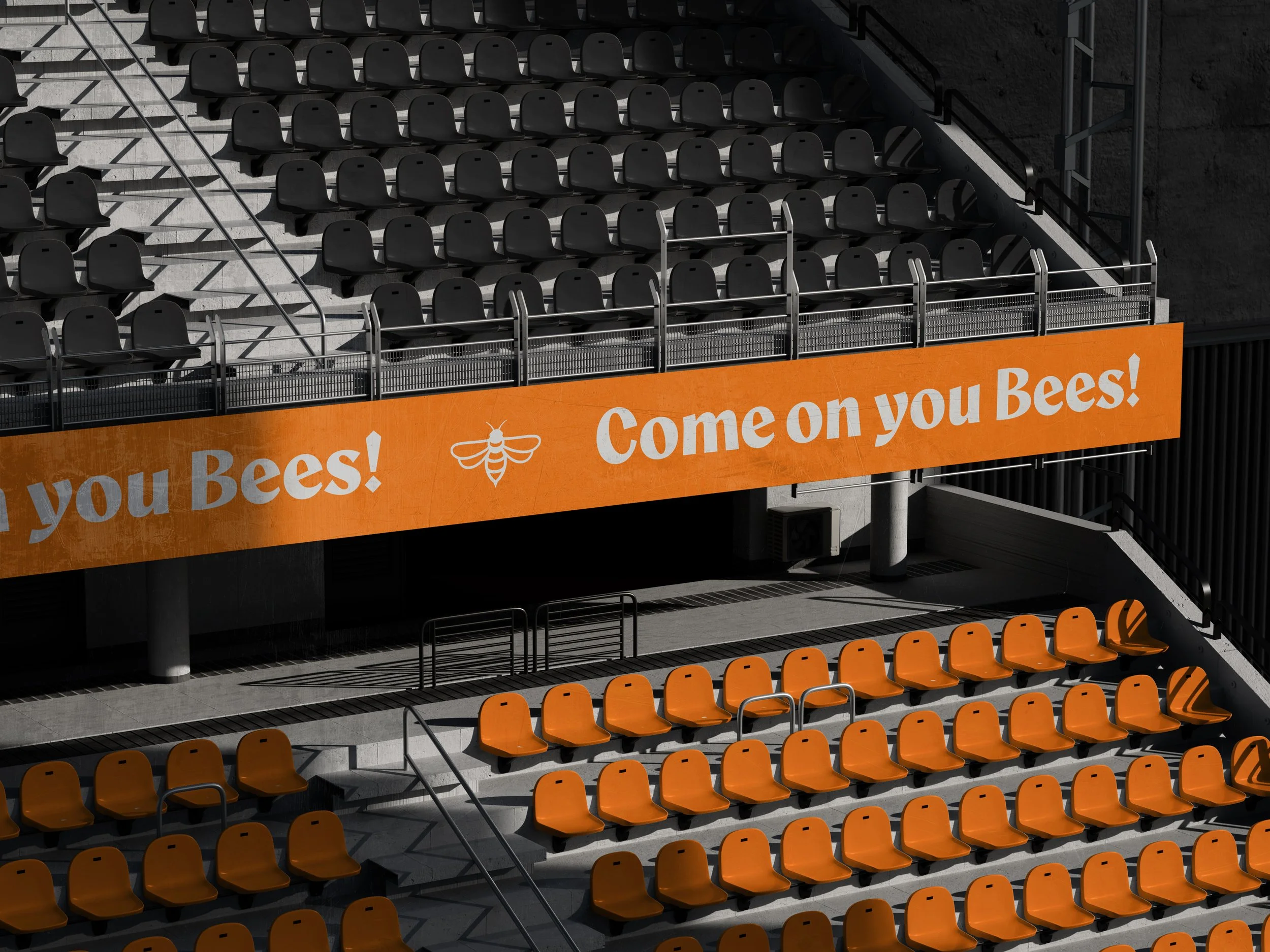
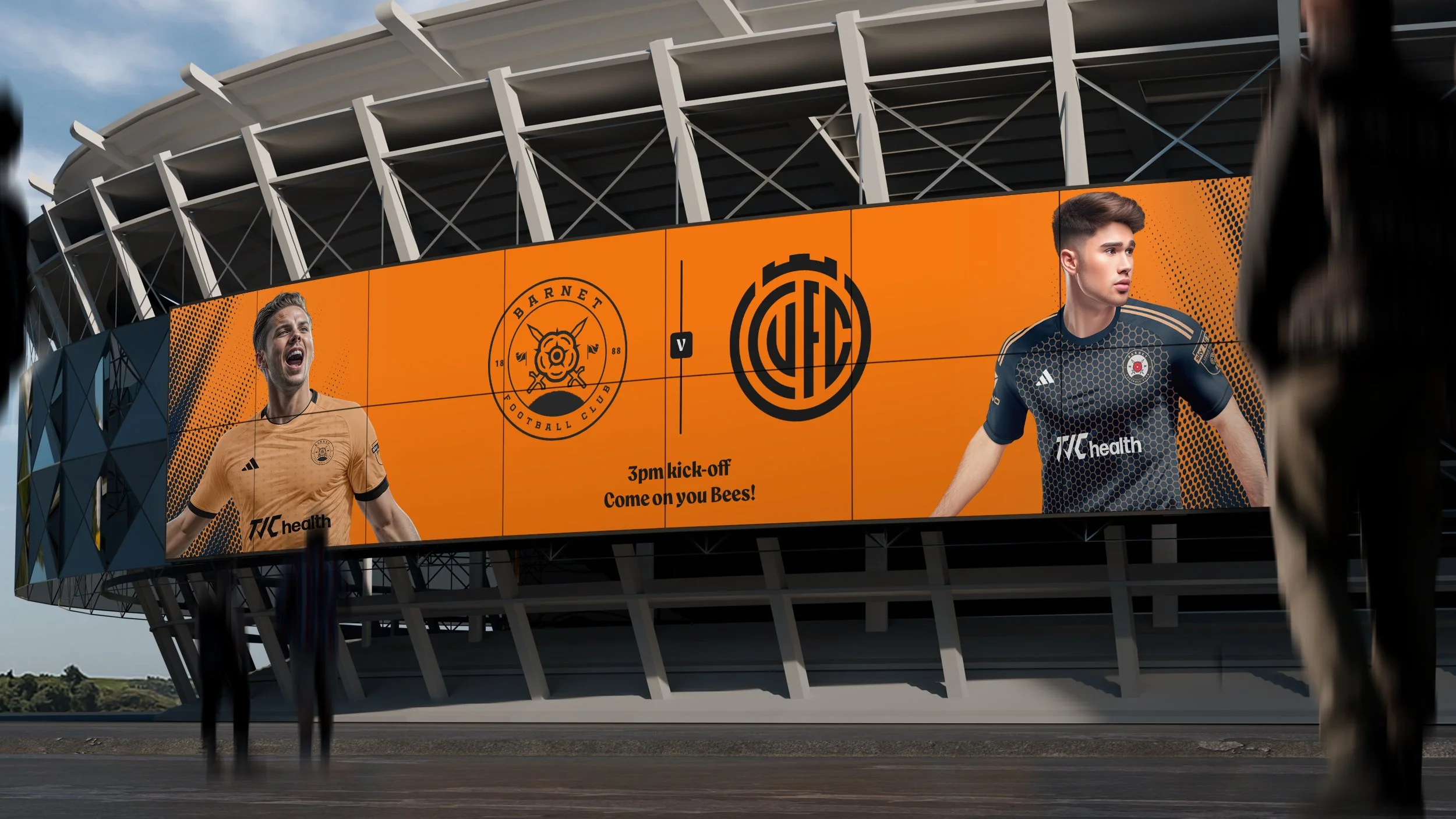
The redesign focused on simplifying and refining the club crest while developing a cohesive visual system that could extend across kits, stadium signage, merchandise, and digital media. Typography, colour usage, and graphic elements were designed to create a contemporary identity that remained rooted in the club’s traditional colours and symbolism.
OUTCOME
The project demonstrates how a football club identity could evolve into a modern brand system capable of working across physical environments, merchandise, and digital platforms while maintaining a strong connection to the club’s heritage.
Barnet FC
DELIVERABLES
Visual identity
Logo design
PROJECT TYPE
Personal
Concept rebrand
ROLE
Creative direction
Brand ownership
YEAR
2025